Introduction
Hey everyone! Welcome to another blog of mine! Today I'll show you how I built a simple travel journal page using React. This project added to my learning by making me comfortable with React props.
First Things First
Instead of using create-react-app, I used Vite because it is faster. Open your IDE and in the terminal, enter
npm create vite@latest
Then, enter the name of the directory you want to create. I named mine "travel-journal" Choose React from the list of options. Then choose React again since this project does not utilize TypeScript. Vite will give you a sample React page.
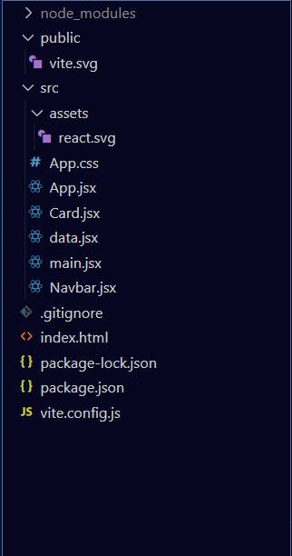
We want to separate the different parts of the webpage. React components to the rescue! Create two new components called 'Card.jsx' and 'Navbar.jsx'. As you might have guessed, the Navbar component will be used for setting up the Navbar of the page and the Card component will be used for the main area of the webpage. Now, create another component called 'data.jsx'. This will be used to provide data to our React props. Ideally, we shouldn't have to do this and instead an API would be doing that for us. However, I haven't used APIs as I haven't learnt how to do that in React yet (maybe in the next blog?). Lastly, delete index.css. Your file structure should now look something like this:

Laying the Foundation
We can make use of the stuff that is given to us by Vite. Delete the unneeded elements and keep the ones that are useful. Since most of the work is gonna be done by our components, we don't have to do much in this step. I set up a font-awesome kit because we need to use some icons. You can learn how to use font-awesome here. I've also added the font 'Inter' from Google fonts. Your index.html file should now be something like this:
<!DOCTYPE html>
<html lang="en">
  <head>
    <meta charset="UTF-8" />
    <link rel="icon" type="image/svg+xml" href="/vite.svg" />
    <link rel="preconnect" href="https://fonts.googleapis.com">
    <script src="https://kit.fontawesome.com/419b99ae8d.js" crossorigin="anonymous"></script>
    <link rel="preconnect" href="https://fonts.gstatic.com" crossorigin>
    <link href="https://fonts.googleapis.com/css2?family=Inter:wght@200;300;400;600;700&display=swap" rel="stylesheet">
    <meta name="viewport" content="width=device-width, initial-scale=1.0" />
    <title>Travel Journal</title>
  </head>
  <body>
    <div id="root"></div>
    <script type="module" src="/src/main.jsx"></script>

  </body>
</html>
Using the Components
One thing to remember is that in React, by convention, the names of our components start with a capital letter. We can define React components using either ES6 classes or using functions. Here, we'll use functions. The syntax is:
import React from "react";
export default function NameOfFunction(){
  return (
    console.log("Something")
    //what needs to be returned
  )
}
Navbar.jsx
Let's go to 'Navbar.jsx'. We are creating a very simple Navbar showing just an icon (from font-awesome) and the text "my travel journal." alongside it. Here is the code:
import React from "react";
export default function Navbar() {
  return (
    <div className="navbar">
      <div className="navaligner">
        <i className="fa-solid fa-earth-americas"></i> my travel journal.
      </div>
    </div>
  );
}
Data.jsx
This file will serve as the "input" for our App.jsx file. This file will be an array of objects. It will contain information about the places in our journal ie. the name of the place, where it is located, its position on Google maps, a description, duration of visit and a thumbnail. This is what the file looks like in my case. Feel free to edit the file as per your wish
export default[{
    id:"1",
    title:"Nandi Hills",
    location: "Karnataka",
    googleMapsUrl:"https://goo.gl/maps/F3ayYxGPvUJUEFpK6",
    startDate:"26 June, 2022",
    endDate:"27 June, 2022",
    description:"Nandi Hills are located in Bangalore. They are a sight to behold and the weather there is always rainy.",
    imageUrl:"https://img.traveltriangle.com/blog/wp-content/uploads/2018/05/Cover2.jpg"
}
,
{
    id:"2",
    title: "Rann of Kutch",
    location: "Gujarat",
    googleMapsUrl:"",
    startDate:"22 June, 2017",
    endDate:"27 June, 2017",
    description: "Rann of Kutch is a massive expanse of cracked earth, inland from the sea, that promises to take your breath away.",
    imageUrl:"https://www.gujarattourism.com/content/dam/gujrattourism/images/weekend-get-aways/great-rann-of-kutch/Great-Rann-Of-Kutch-Banner.jpg"
},
{
    id:"3",
    title: "Totally Not Creepy House",
    location:"Movies",
    googleMapsUrl:"https://www.youtube.com/watch?v=dQw4w9WgXcQ",
    startDate:"6 September, 1969",
    endDate: "6 September, 1969",
    description:"A house that looks completely safe and free from any sort of ghostly activity. Conjures a welcoming vibe, for sure.",
    imageUrl:"https://api.time.com/wp-content/uploads/2015/10/the-conjuring1.jpg?quality=85&w=2000"
}
]
Clearly, I had some fun with the locations 😆
Card.jsx
There are three cards in our journal. We need to devise a way in which we only need to configure one component and be able to duplicate our config to the other two cards, with the data being different, of course. Again, React to the rescue! In our Card.jsx component, we'll enter props as a parameter of the function. This way we'll be able to insert the things we have written in our data.jsx file in our cards. Since we have an array of objects in our data.jsx file, we'll be able to use the .map() function of JavaScript in order to fetch data from each element in that array. So, we'll use a 'props' parameter in our Card function. Finally our file will look something like this:
import React from "react";

export default function Card(props) {
  return (
    <div className="onecard">
      <div className="theimage">
        <img src={props.item.imageUrl} id="cardimage" />
      </div>
      <div className="text">
        <div id="locationmap">
          <div id="location"><i className="fa-solid fa-location-dot" id="locicon"></i> {props.item.location}</div>
          <div id="map"><a href={props.item.googleMapsUrl}>View on Google Maps</a></div>
        </div>
        <div id="someplace">{props.item.title}</div>
        <div id="dates">{props.item.startDate} - {props.item.endDate}</div>
        <div id="description">{props.item.description}</div>
      </div>
    </div>
  );
}
Main.jsx
The only thing we'll do in this component is render the App component lol
import React from 'react'
import ReactDOM from 'react-dom/client'
import App from './App'

ReactDOM.createRoot(document.getElementById('root')).render(
    <App />
)
App.jsx
In our App function we'll first use a .map() to map over the array of objects in "data.jsx". The resultant array of this we'll store in a variable called cards. Our App function will return the Navbar and the new array on the webpage. Here's what the code will look like:
import { useState } from "react";
import reactLogo from "./assets/react.svg";
import "./App.css";
import Navbar from "./Navbar"
import Card from "./Card"
import data from "./data"
function App() {
  const cards=data.map(item=>{
    return(
      <Card
      key={item.id}
      item={item}
      />
    )
  })
  return (
    //root-->app-->theapp
    <div className="App">
      <div id="theapp">
        <Navbar />
        {cards}
      </div>
    </div>
  );
}

export default App;
Add Some Style!
Now let's get to styling the page. After all we don't want a bland website now do we? In the App.css file, paste the following code:
*{
  box-sizing:border-box;
  margin:0;
  padding:0;
}


body{
  background: rgb(7, 7, 7);
  font-family:Inter, sans-serif;
  height:100vh;
  border:1px solid black;
  display:flex;
  justify-content: center;
  align-items: center;
  color:white;
}

#root{
  width:50%;
  height:100%;
  display:flex;
  align-items:center;
  justify-content: center;
  flex-direction: column;
  /* border:1px solid black; */

}

.App{
  display:flex;
  align-items: center;
  justify-content:center;
  /* border:1px solid blue; */
  width:100%;
  height:100%;
}

#theapp{
  background:rgb(23, 23, 23);

  display:flex;
  flex-direction: column;
  align-items: center;
  /* justify-content: center; */
  /* border: 1px solid red; */
  height:100%;
  width:100%;
}

.navbar{
  font-weight: 300;
  display: flex;
  align-items: center;
  justify-content: center;
  background:#ec4b4b;
  width:100%;
  height:6%;
  text-align: center;
  margin-bottom:3%;
}


.onecard{

  align-items:center;
  /* border:1px solid white; */
  display: flex;
  text-align:center;
  width:80%;
  background:rgb(23, 23, 23);
  height:30%;
  padding-block:12px;


}

.theimage{
  border-radius: 5px;
  width: 23%;
  height:100%;
  /* border:1px solid white; */
  margin-right:5%;

}

#cardimage{
  border-radius: 5px;
  align-self: center;
  width:100%;
  height:100%;
  object-fit: cover;
}

.text{
  display:flex;
  flex-direction: column;
  /* border:1px solid white; */
  width:72%;
}

#locationmap{
  display:flex;
  /* border:1px solid white; */


}
#location{
  /* border:1px solid white; */
  letter-spacing: 3px;
  font-size:1.1em;
  font-weight: 300;
  text-align: left;
  width:fit-content;
  padding-right:10px;

}
#map{
  align-self:flex-end;
  font-size:0.9em;
  color:rgb(208, 207, 207);
  text-align: left;
  /* border-bottom:1px solid rgb(208, 207, 207); */


}
#locicon{
  color:#ec4b4b;
}

#someplace{
  font-size:2em;
  color:rgb(241, 241, 241);
  font-weight:700;
  text-align: left;
  margin-top:0.2em;
}
#dates{
  font-size:0.9em;
  font-weight:600;
  text-align: left;
  margin-top:1em;
}

#description{
  text-align: left;
  margin-top:0.5em;
  font-weight: 400;
  font-size:0.85em;
  letter-spacing: 1px;
  line-height: 1.6;
  color:rgb(220, 220, 220);
}

a{
  color:unset;
}


@media(max-width:1100px){
  #root{
    width:65%;
  }

}
@media(max-width:900px){
  #root{
    width:80%;

  }
  .onecard{
    width:85%;
  }
  #someplace{
    font-size:1.7em;
  }
  #location{
    font-size:1em;
  }
  #map{
    font-size:0.85em;
  }
  #dates{
    font-size:0.85em;
  }
  #description{
    font-size:0.85em;
  }

}

@media(max-width:600px){
  #root{
    width:90%;

  }
  .onecard{
    width:87%;
  }
  #someplace{
    font-size:1.6em;
  }
  #location{
    font-size:0.87em;
  }
  #map{
    font-size:0.77em;
  }
  #dates{
    font-size:0.77em;
  }
  #description{
    font-size:0.8em;
  }

}

@media(max-width:500px){
  #root{
    width:100%;

  }
  .onecard{
    width:90%;
  }
  #someplace{
    font-size:1.55em;
  }
  #location{
    font-size:0.92em;
  }
  #map{
    font-size:0.8em;
  }
  #dates{
    font-size:0.82em;
  }
  #description{
    font-size:0.82em;
  }

}


@media(max-width:400px){
  #root{
    width:100%;

  }
  .onecard{
    width:95%;
  }
  #someplace{
    font-size:1.5em;
  }
  #location{
    font-size:0.9em;
  }
  #map{
    font-size:0.75em;
  }
  #dates{
    font-size:0.8em;
  }
  #description{
    font-size:0.8em;
  }

}
Haven't done anything fancy here. Just one thing to note is that I have made use of flexboxes. One more thing is that I've added many media queries to avoid the page from breaking. They just make it very easy to implement the type of design we want. Also, I used the Dark them because, well, don't come at me but dark theme >>>>> light theme!
Does It Work Though?
Well, find out by running this command in the directory of your project (for example in my case it was travel-journal)
npm run dev
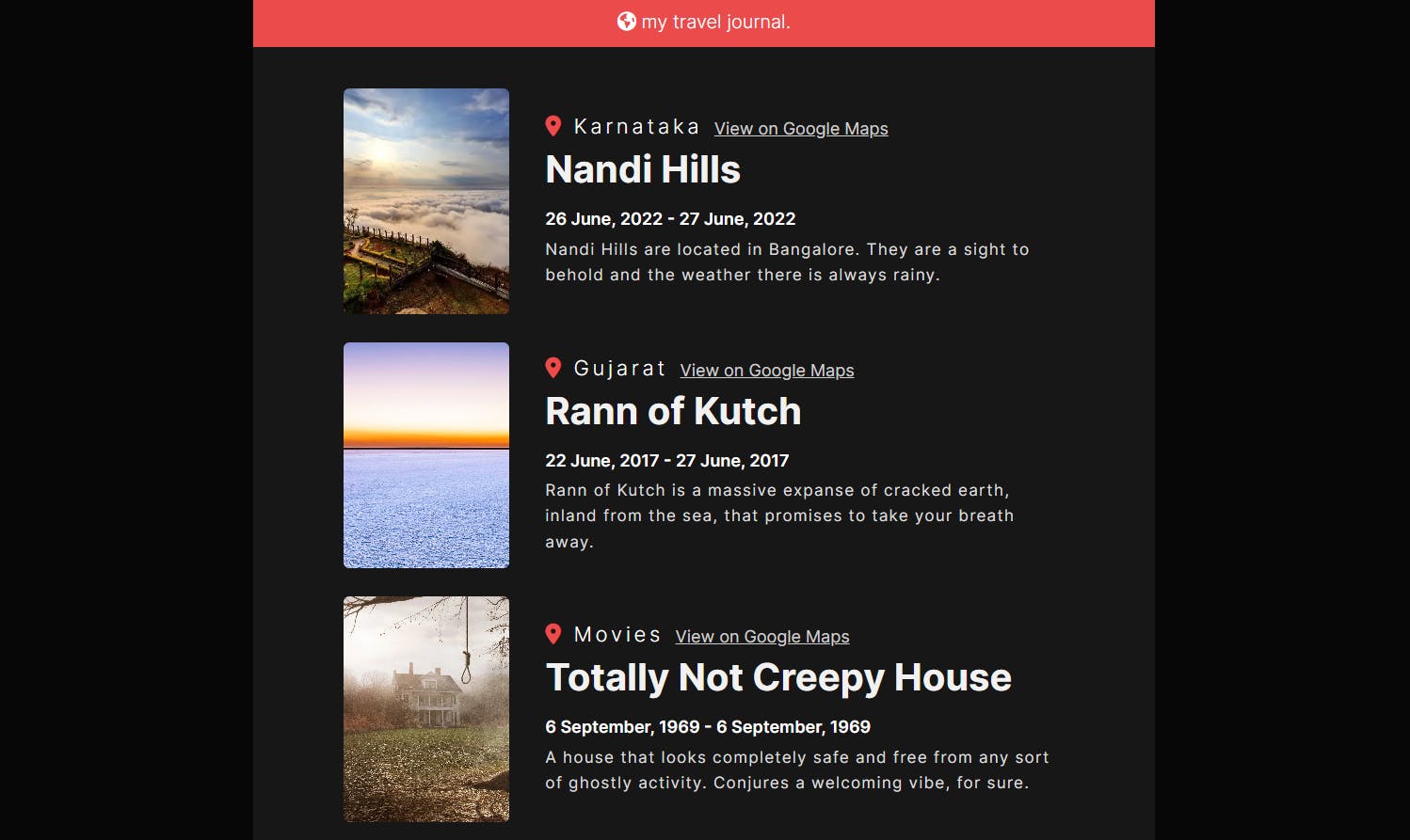
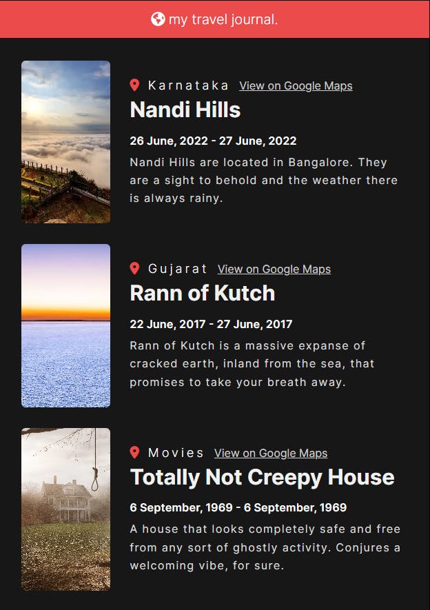
You should get something like this
on wider screens

on thinner screens

Conclusion
And that's it! We have successfully created a travel journal using React. Next time I'll use an API to fetch prop data. Stay on the lookout for that one!
Thank You
 Thank you so much for reading this blog to the end! I hope you enjoyed reading this and/or learnt something new! See you in the next blog 🙋♂️🙋♂️

